
I choose my background paper to match the cute pink foot on the one photo. Unlike the sepia photos, where I worked on a printed background, I choose to work on monochrome paper this time around.

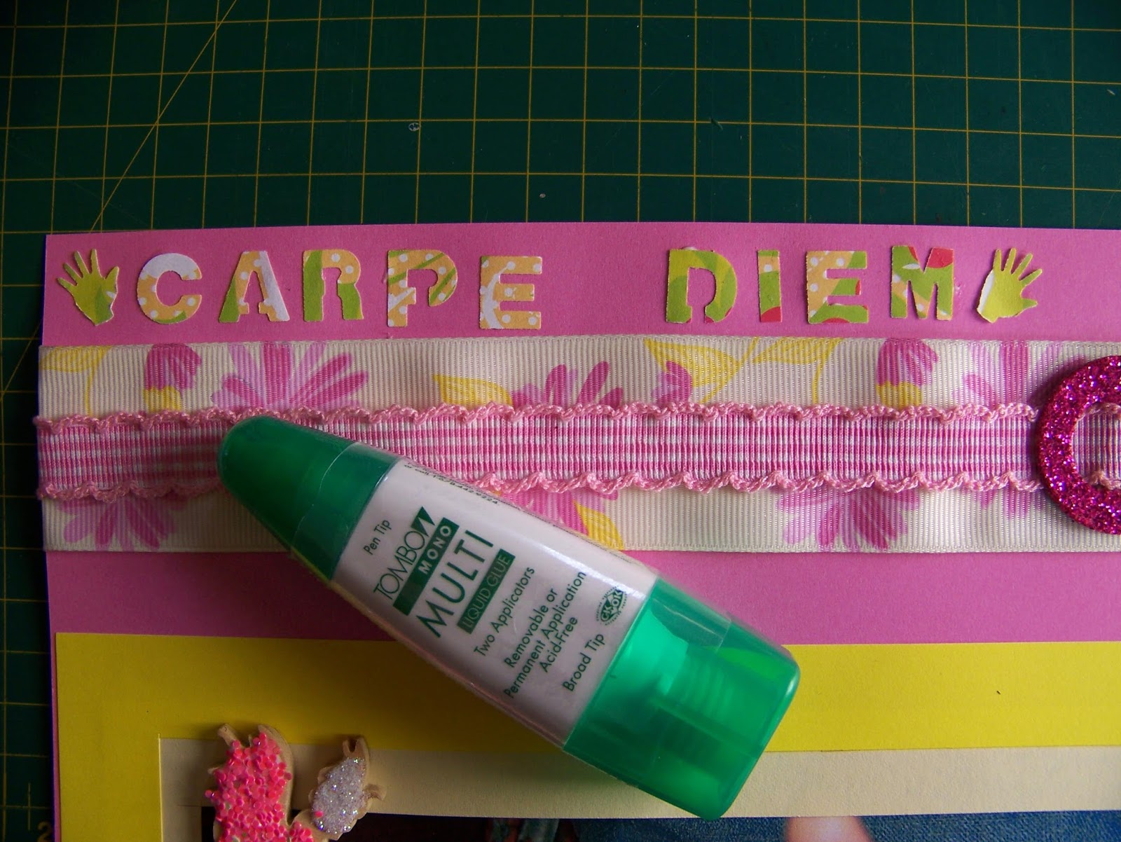
I want to use this flowery ribbon in the layout and choose the colors for the borders to match the ribbon. I test the sequence of the double frames by laying the options side by side. I like the brighter one on the outside and this will be the biggest frame.

I retain the maximum size on the outer frame, which is 21 x 30 cm, and cut it 2 cm wide. I use a craft knife and metal ruler to do this, while using the markings on the cutting mat to guide me.

I crop the inner frame to measure 19 x 28 cm.

I then cut the inner frame to also be 2 cm wide.

I now need to crop my photos to fit in the frames. This means the photos need to measure 17 x 26 cm.

Attach the frames with double-sided tape.


When sticking the photos down, I make sure to position the papers side by side so the photos will lie at exactly the same height on the page.

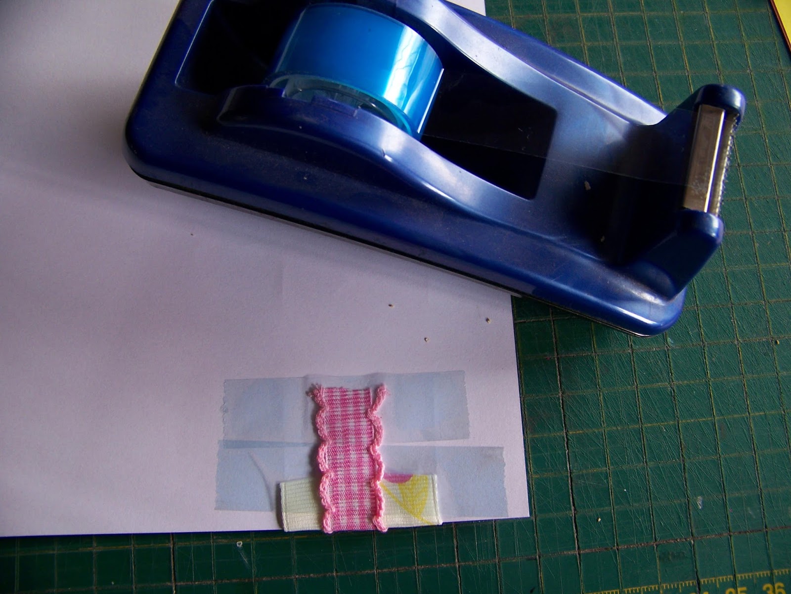
I now cut the ribbon to be slightly longer than the width of the paper so I can fold the ends over. The ribbon is attached with double-sided tape.


I lay a second ribbon on top of the first and attach it too with double-sided tape, folding the sides over at the ends. This time I weave the ribbon through a cardboard and glitter buckle. I do this only on one of the pages, believing that even though I keep repeating my actions on one page on the next as well, it would be too much to add a second buckle.


Again, the papers are laid side by side to get the ribbons in line on the two pages.

I have these two cute fairies that I want to add to the layout, along with the toadstools. The wood is too bland and I decide to glue some glitter on the fairies. I start by applying glue to the faces, legs and arms.

I sprinkle white glitter on the wet glue. I shake off the excess and use the paper plate as a funnel to put the excess back in the bottle.

I repeat the same process with the pink glitter, this time applying the glue to their wings and bodies.

I apply only a little bit of glue to the back of the fairies and lay them in place on the paper. Both the backs and fronts can dry on the paper as keep working on the layout. If you are uncomfortable with this, you may choose to put them aside to dry before adding them to the layout.


I love wooden embellishments for paper crafts because they automatically add dimension and texture to the layout. Here you can see the row of mushrooms/toadstools I added to the bottom of the layout.

I have a printed craft paper off-cut left over from a previous project and I like that this will add some additional color to my layout. Too much pink and yellow becomes boring. Always try to incorporate more colors, even if only in small amounts. I punch four tags from this paper.

I punch the journaling for the layout from the same off-cut. I also two small hands and feet from this paper.

I attach the journaling and hands and feet with Tombow glue to the layout. The Tombow has a very fine point which allows for precision work.
I use an awl to punch a hole through the tags and the paper so I can attach it with split pins to the layout.


I vary where I place the journaling and the tags to make it a little more interesting.

The feet are also not placed in the same position as the hands.

The final layout is exactly similar to the previous, but this different approach to it has resulted in a brand new look.

For more crafty ideas and great products, visit APrettyTalent.com.
Remember to keep nurturing your TALENT for making PRETTY things.
You can subscribe to this blog and receive regular updates by email by simply registering your email address at the top of the current blog.
No comments:
Post a Comment