
I started by dividing my double page spread into four equal rectangles. You can decide for yourself how big you would like them to be. Mine were 13x15 cm each.

I then use a pencil to draw the center of a flower across the four frames.

The next step is to draw a flower across the frames. Don't struggle too much with forming the petals 'just right'. We will only be using them as guidelines to assist in getting the colour lines to lie in the correct direction.

Feel free to use any coloring, or even painting, medium of your choice. I opted to use four different sets of pencils on mine as I wanted to enhance the idea of differences between the seasons of our lives. You could do it as successfully if you only had access to a single set of pencils as well.

I started off with a pale yellow in my autumn season. If you like, you could allow yourself to link specific people or events to the colours you choose when colouring the autumn season of your own life.

You will note that I continued colouring outside the restrictive lines of the petals. The guidelines of our lives are not cast in stone. We get to colour outside the lines, sometimes by chance, and sometimes by choice. Sometimes the outcomes are positive, and at other times they work towards our detriment. Whichever it may be, they are the colours of our lives and we need to make our peace with them.

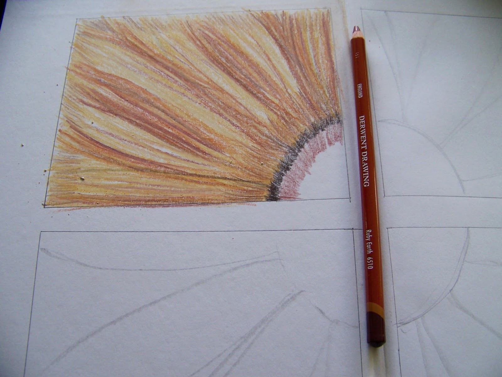
I continue adding colour to the petals. This time I go a shade darker. Certain events or people leave a darker impression on our lives and no single season can be coloured in a single shade.

I go even darker still to add the shadow areas. We are really exploring the depths of each season.

Then I add a warmer shade, as every single season also had a bit of warmth to contribute towards our lives and it is important for us to acknowledge these or else we risk becoming very negative.

The highlights of the season are added in the palest shade I can find. This is where the sun hits the flower and bounces off the petals.

Now it is time to start colouring the center of the flower. I use the same shades of the petals to colour the center as well. As we move in, you will note that the shades become lighter and lighter with the darkest shade on the outer rim.

We tend to keep our distance from those things that really risk hurting us and that is why we keep the darker shades on the outside.
As we move towards the center, we use the warmer and lighter shades. These are the shades that we feel safer and more comfortable with.

These inner shades are the ones where we risk lowering our defenses for.

Finally, at the heart of the center, I do the unthinkable and use the darkest shade again. If some hurt had not been able to penetrate past my defenses, I would have no need for doing this journal page. It would serve no purpose to ignore that hurt. I can not deal with what I ignore. That is why I choose to add this painful colour right at the heart of the autumn flower.

I then changed colouring mediums to colour the Winter flower.

I started off with a very pale grey. Winter represents that season in our lives that holds the biggest heartache and pain, even loss. These are the times we would rather forget, but not dealing with them is not healthy. That is why we choose to face them in our wellness journal.

I move directly to a very cold blue, asking myself who, and which events made me feel this cold and desolate in my life.

I add a Dark Indigo for the next shade. I am truly allowing myself to explore the full depth of the tragedies in my life.

Then I use a much warmer violet with which I acknowledge that even the darkest times in my life held some warmth and had some people and events to make them better.

I want to explore this idea even further and allow myself to do so by adding an even warmer shade which I use on the outer rim of the center of the flower. This season is all about the hurts that made it past my defences and the warm colours are on the outskirts of the perimeter this time.

As I move closer towards the center of the circle, the colours become colder.

They become even colder still.

Notice how the warmer and the colder colours have points where they cross into each other. This is quite significant, don't you think?

I add the surprise element when I use the warmest shade right at the heart of the center of the flower. If you search yourself carefully, you will have to acknowledge that even in your darkest hour, there was still a spark of hope present and that hope lay in the dawning of a new Spring.

I change pencil sets once again to colour the Spring season of the flower.

I start with a very pale pink for this season. Most often our awakening into a Spring season happens very gently and we are scarcely aware of the change in seasons.

Then one day, we suddenly realize that our situation is not quite so bleak any more and that we are feeling a bit more upbeat about life. I use a more intense colour to illustrate this realization.

It is not as if there are no signs of winter left anymore. It is simply that it has lost its stifling hold on us. I use a soft lilac purple to add that tinge of coldness that still remains.

We have shifted our focus and can see more clearly the people and events that contribute positively to our well-being. I use and even more vibrant pink to illustrate this.

Finally, we realize that joy has been restored to our lives. We can laugh again, love again, have happy thoughts once more. This is illustrated with a vibrant shade of red.

When colouring the center of the circle, a cold Indigo is still used on the outer perimeter. There are still things we need to guard against and we are still hurting. The difference is that it has become more manageable.

As we move closer to the center of the flower the shades become softer.

We allow all of those warm and vibrant shades to penetrate deep into our hearts.

It is very important to learn to open ourselves up to life again after being hurt. If we remain closed off, the hurt will fester and have a detrimental influence on our lives. Opening up, allows the puss to get our, but it also allows the good to come in.

This time when we add the coldest colour to the heart of the flower, it has lost its sting. We are a little tougher and we have acquired a whole new skill set that allows us to deal with life's challenges.

I switch to my most vibrant set of colouring pencils to colour the season of Summer.

This time I start with a sunny, but pale, yellow. As always, the transition from one season to the next is a subtle one.

In order to acknowledge that life has been restored to me, I use a vibrant green, the colour of growth and life.

I add a muted green next. The thing about life is that we need to search for a balance. Not all the shades in our lives can be sunny vibrant ones. The muted ones also contribute to the sum total of our life experiences. We can not avoid dealing with it.

However, we should not linger on the negative too much so that it starts make us ill. This is why I add a very bright yellow in the next step to express my determination to focus on what is positive and beautiful in life.

Adding a colder (bluer) shade of green on the outer perimeter of the flower's center, is enough reminder of the painful parts of life.

Adding the muted green next, seems a natural flow of events.

Bringing in a vibrant green to represent life, makes sense as I have learned something of the balance of life and death during the seasons I have undergone.

I then start adding the yellow greens to add more sunshine to my life.

I go even brighter still when I reach the dead center of the flower.

Adding that blueish green to the center of the flower, no longer holds such a threat to me. I have learned that I am strong enough to overcome.

I use a black pencil to accentuate the dividing lines between the seasons. All things in life has a beginning and an end. I do not need to drag yesterday's pain into today's joy.

Sitting back, I contemplate the journaling I want to add to the layout.

I find my fine liners to do the journaling with.

I start by identifying the seasons of my life. You may even want to use dates, names, events, people, etc to identify yours with. I opted to keep it very general in order to make mine more accessible to a broader audience.

Then I write the following in the margins: "When viewed separately, the seasons of our lives may seem like broken pieces ...

... but under the transforming, guiding directorship of God, they have the ability to merge into a beautiful whole." Miekie.

God can turn the broken pieces of your life into a beautiful whole as well.

Marietjie Uys (Miekie) is a published author. You can buy the books here:
You can purchase Designs By Miekie 1 here.
Jy kan Kom Ons Teken en Verf Tuinstories hier koop.You can purchase Designs By Miekie 1 here.
Jy kan Kom Ons Kleur Tuinstories In hier koop.
Jy kan Tuinstories hier koop.
For more crafty ideas and great products, visit A Pretty Talent on Facebook.
Remember to keep nurturing your TALENT for making PRETTY things.
You can subscribe to this blog and receive regular updates by email by simply registering your email address at the top of the current blog.
No comments:
Post a Comment